Rosterball - Looking into the statistics of good and bad schedules

Introduction
Staff scheduling has a tremendous amount in common with the ideas explored in one of my favorite movies, Moneyball. Like Brad Pitt, schedulers have to squeeze a winning amount of productivity out of their team, while staying within a limited budget. In this post, we explore, through the visual language of 4 charts, some of the statistical indicators that highlight what makes a good schedule versus a bad one. These graphs are all based on different real-world schedules, that have been normalised for visual clarity.
Hours efficiency – Deviation from ideal staffing levels by shift
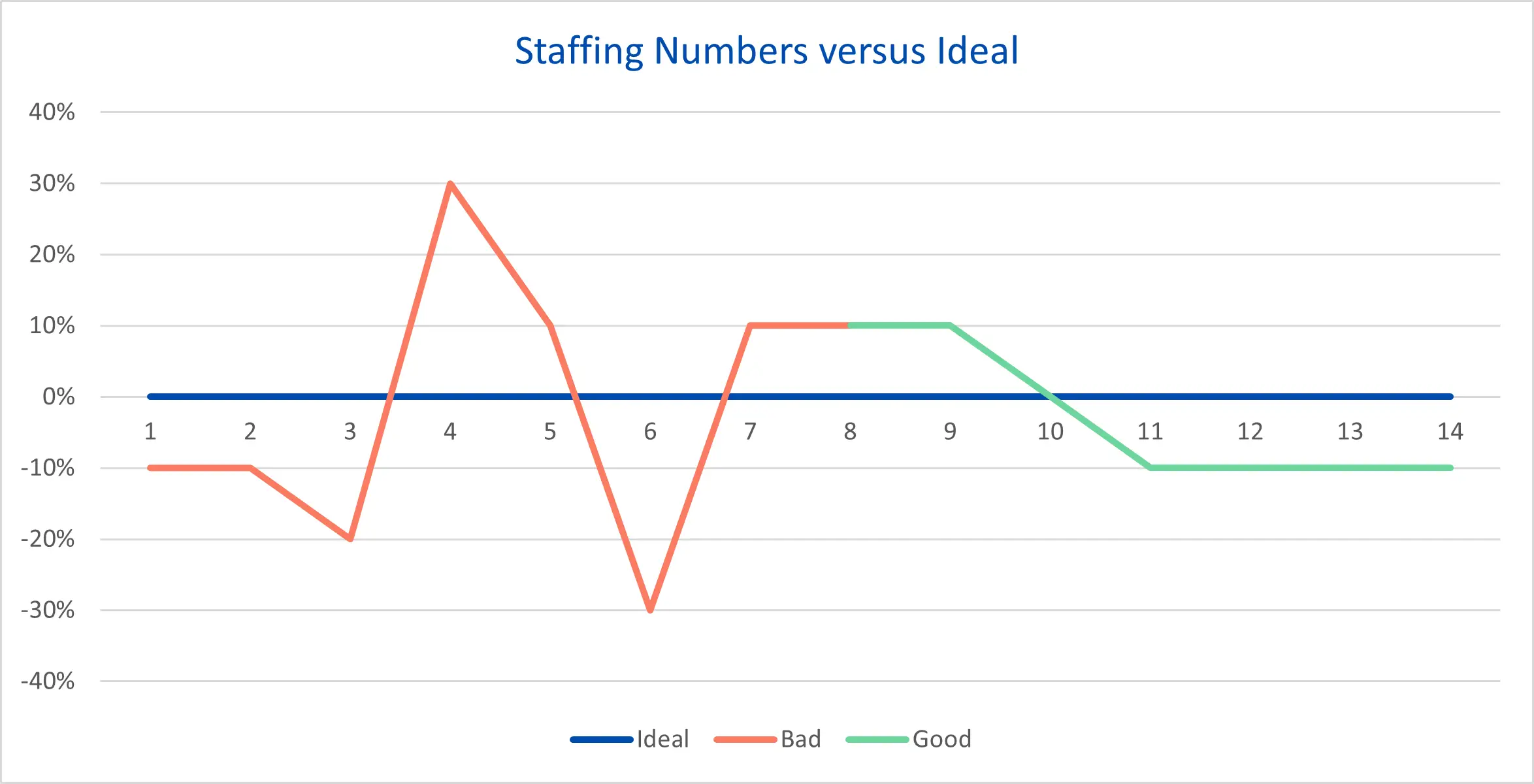
Ever been to the local fast-food joint and seen the queue go from counter to door; wait times far in excess of what you should face for a hamburger? You may have also experienced the converse, where they are so overstaffed that each and every piece of fried chicken you ordered could have been packed by a different person. This graph shows just that, the stressful and potentially dangerous work environment of an understaffed shift and the wasteful excess of an overstaffed shift compared to the ideal staffing level. An understaffed shift is not just harmful to productivity, it is stressful for every single employee scheduled to work that day. This stress induces call outs, and even more understaffed shifts. It’s a vicious cycle.
A well-made schedule uses the same number of total work hours but creates much less variance between the number of staff scheduled and the number of staff required on each day. A well-made schedule ensures everyone has a fair workload, but we’ll talk more about fairness later on.
Schedule Value – Fiscal Cost
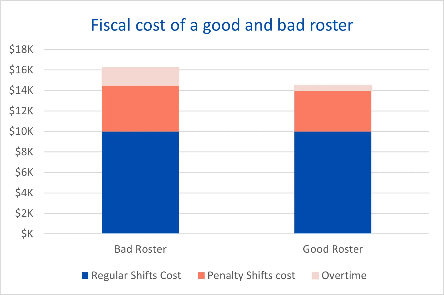
A fixed number of work hours does not mean a fixed cost within a schedule. Since individual employees sit at different parts of the pay scale, anytime one of them works a shift with a pay premium, that premium costs more. A fiscally bad schedule will have these more expensive staff members over-represented for people doing the premium-pay shifts. Schedules that suffer from high deviation from ideal staffing numbers, as shown in the graph in the last section, can also be fiscally bad schedules. These schedules incur large amounts of overtime to cover all the understaffed shifts while seeing no monetary benefit from any overstaffed shifts.
What we haven’t shown is the bad schedule that costs less than the good schedule. To attain that schedule every after-hours shift is worked by only the most junior (cheapest) of staff. Common sense will tell you why that’s a bad idea.
Individual Satisfaction – Percentage of individual preferences fulfilled
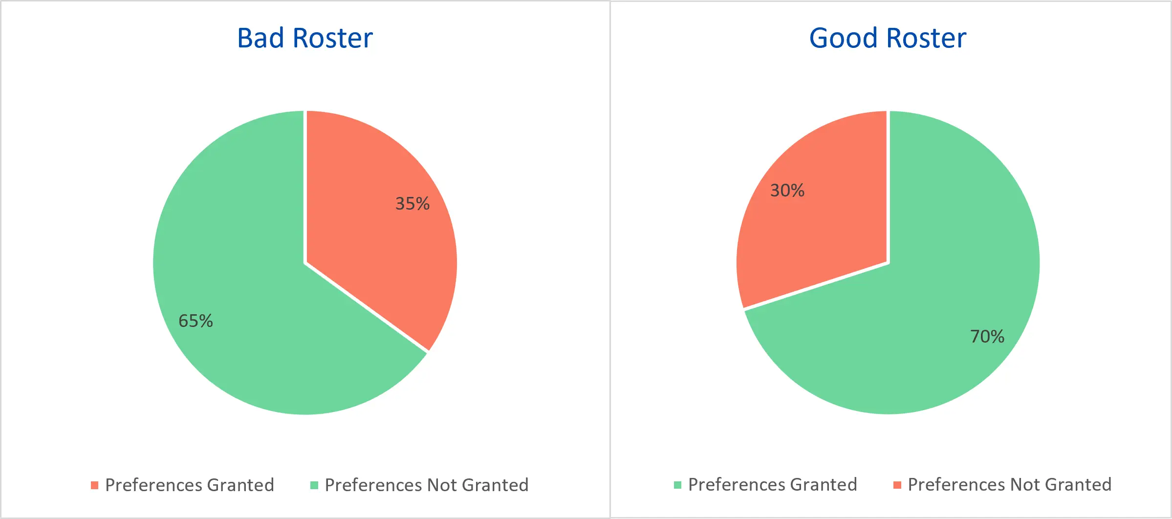
As with actual pies, how satisfied a person is directly correlated with how much of the pie is theirs. In this case, we are looking at how many of the shifts and scheduled day-offs that an individual staff member asks for are accommodated within the schedule. We call each of these requests a preference. Staff members being happier with schedules that reflect their desires, and that fulfill more of their preferences, certainly pass the sniff test. A study from 2010 shows that good schedules are 3rd highest factor for increasing nurses' job satisfaction and the 4th most important factor for decreasing job satisfaction. Just having high preference fulfillment alone is not a sign the schedule is good. Paradoxically, in fact, having too high amounts of preference fulfillment can mean that the staffing level of a schedule is poor and highly variant. The sweet spot of how many preferences are fulfilled will vary from schedule to schedule.
Fairness - Percentage of shifts that are undesirable shifts.
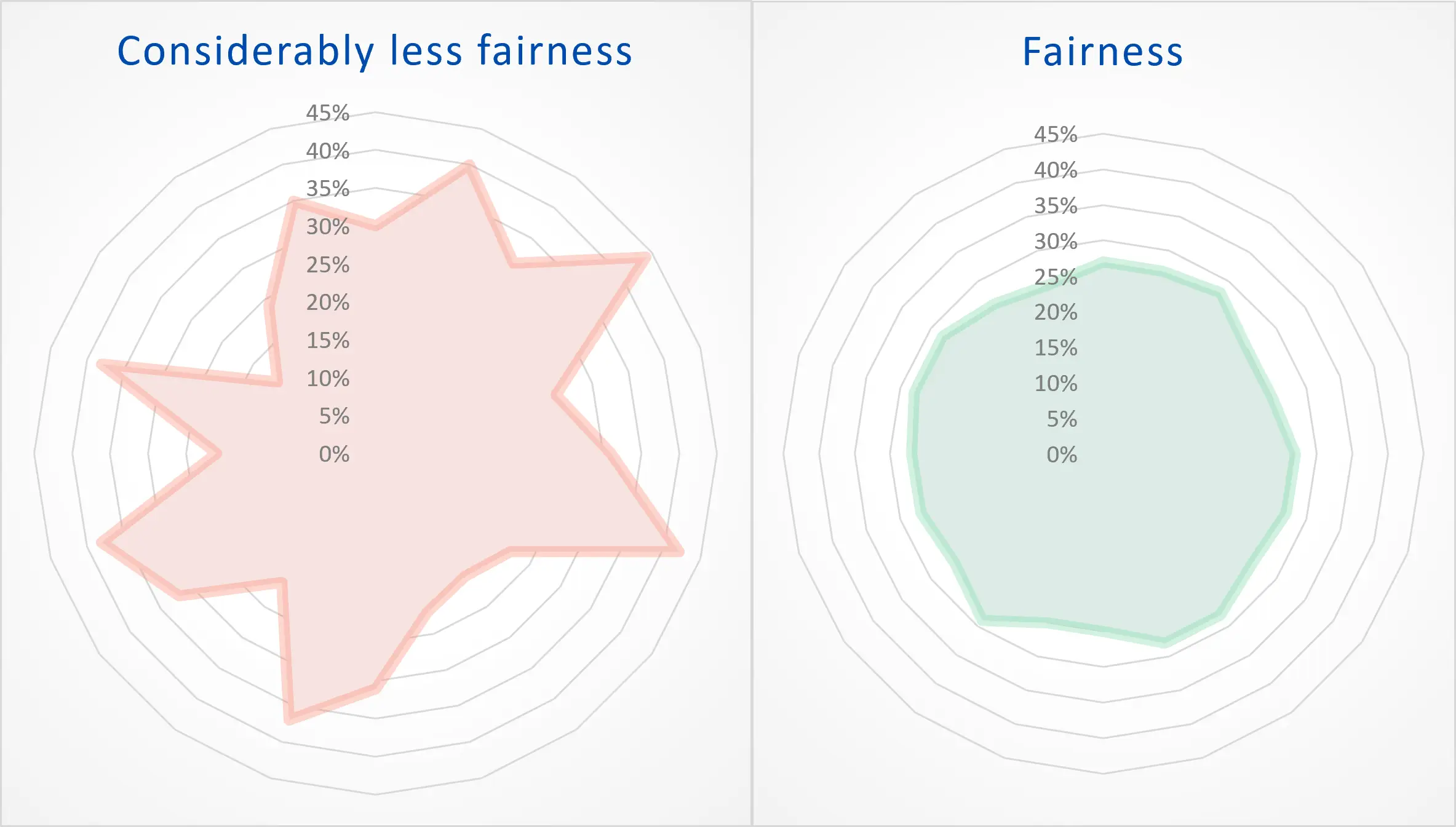
Unfairness is hard to quantify. It is felt by individuals, their unmeasured perception of getting the short end of a metaphorical stick. In a fair schedule, everyone gets the same end, and in a good schedule that stick-end is long (and not overdone, unlike this metaphor). The stick shown by this graph is the ratio of bad shifts to good shifts. You may ask, what constitutes a bad shift? To a degree, it changes from person to person but there are some universal bad shifts, most commonly overnight shifts and weekend shifts. To hit a fairness home run, you want this graph to look like a very round and aerodynamic ball, soaring out of the park.
This graph is equally as important with preferences fulfilled. A spiky graph represents the underlying conditions for thoughts of bias and mistreatment. It’s a real thorn to having workplace harmony.
Conclusion – Time spent scheduling
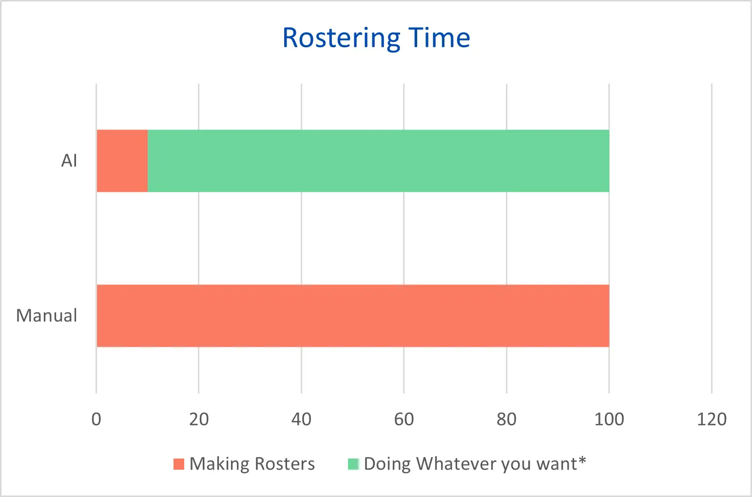
*Rosterlab makes no assurance that your boss won’t make you do other work in the time that you don’t have to spend scheduling anymore.
If you’d like to up your scheduling game beyond human levels, consider adding AI to your process with Rosterlab. The good schedule graphs from above will be what your schedules look like when you let our AI schedule your staff. If that’s not enough, here’s a bonus graph for the time savings from implementing AI scheduling.
You might also be interested in


Ready to Transform Your Workforce Management?
Join thousands using RosterLab to streamline scheduling.